Last Updated on October 12, 2021 by Mathew Diekhake
The set of tiles you get by clicking on the icon that looks like a speech bubble in your taskbar are tiles that are located on the Quick Actions flyout. This flyout is there so you can get quicker access to the main features of Windows that you may need to use and that would be too laborious to have to access from the Start menu.
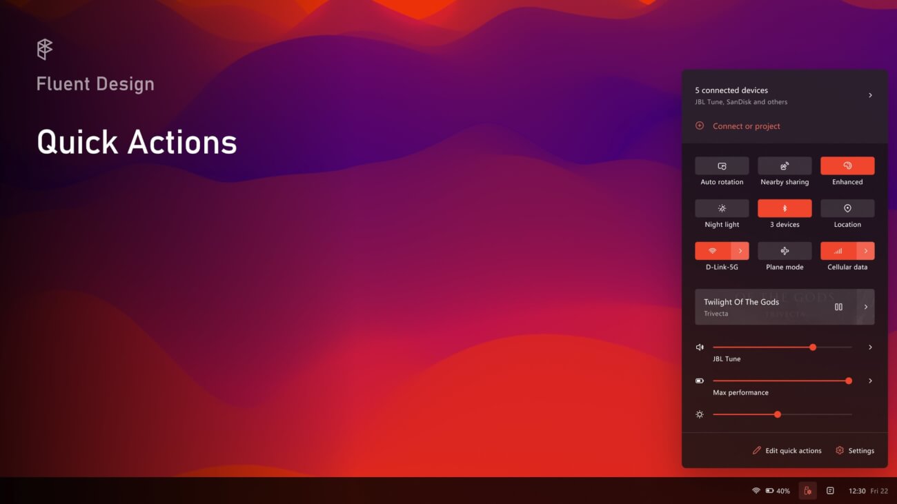
Samuel Ammirata has played around and redesigned the Quick Actions in Windows 10 so that each tile or action becomes a standalone flyout. The design, as one of the commenters was quick to point out, looks very similar to what you would find on a Linux distro.
In Samuel’s words:
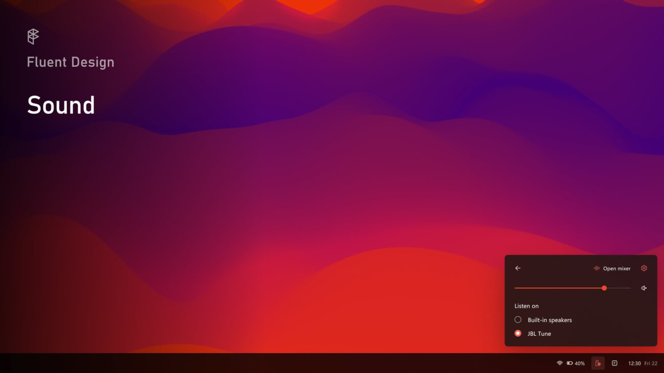
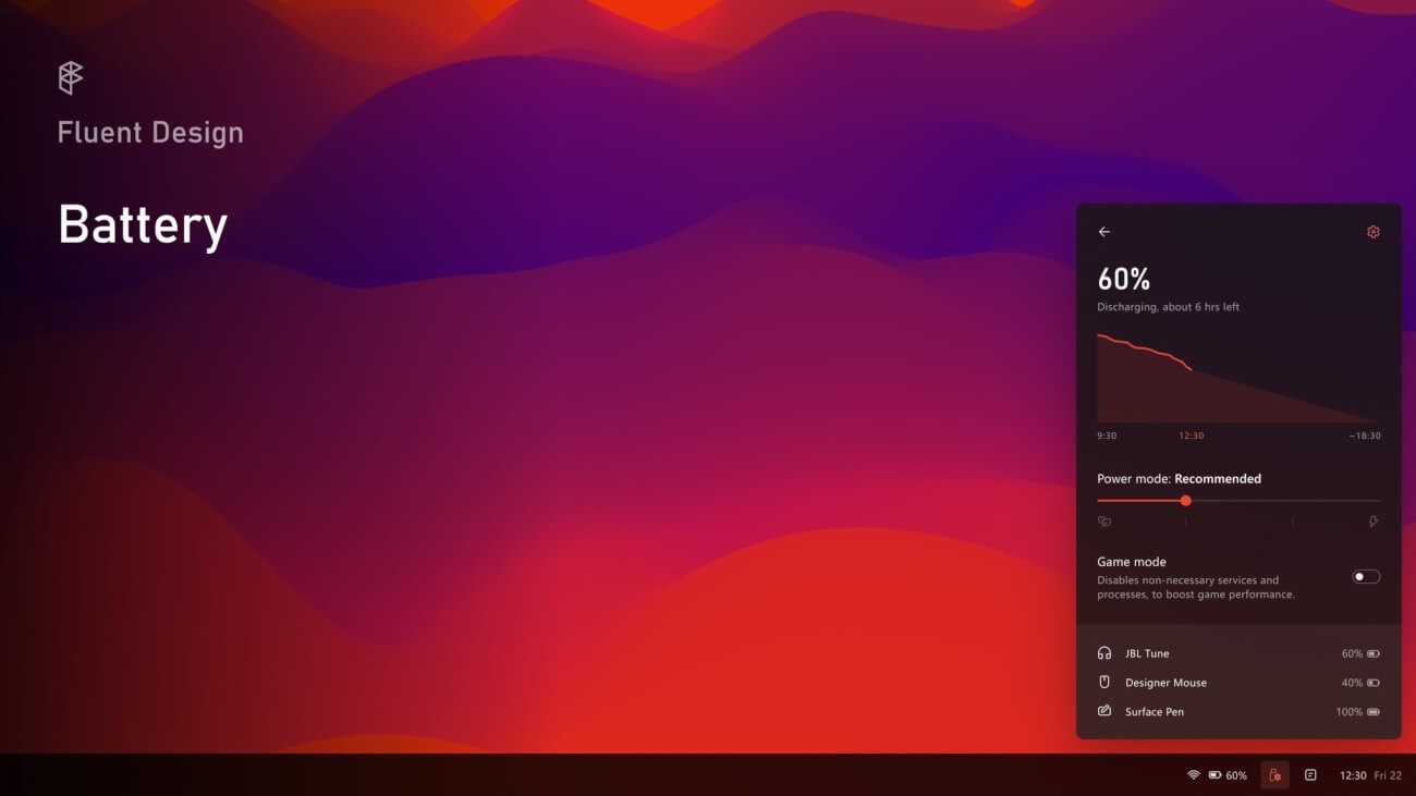
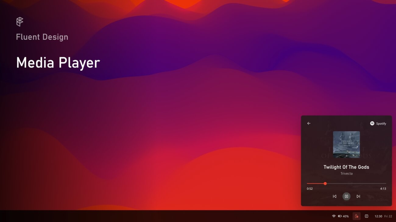
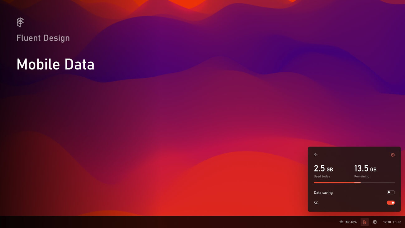
A redesigned Quick Actions experience – a thread. Quick Actions is now a standalone flyout. Everything is now in one place: from connected devices, to volume and battery settings. To access more settings, just click the chevrons.
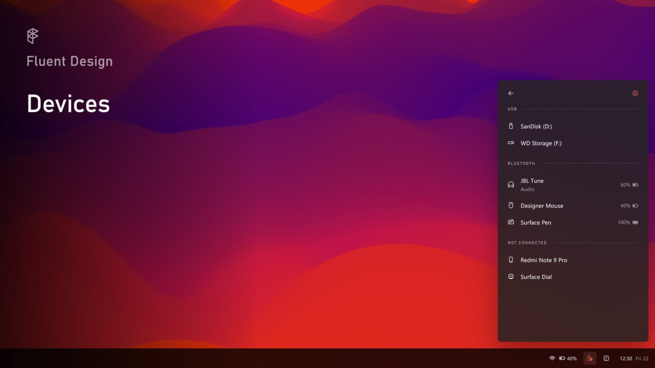
From the “Devices” panel you can see what devices (both USB and Bluetooth) are connected to the PC and manage them.
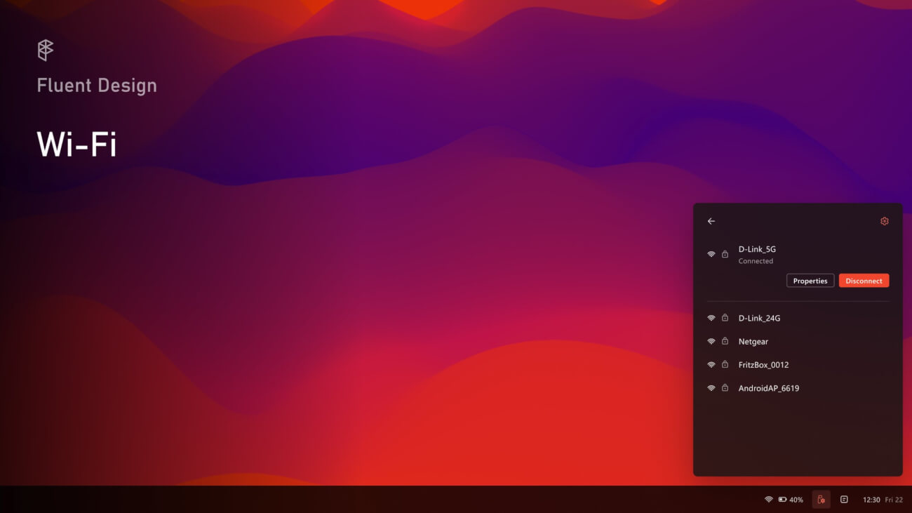
Although the “Wi-Fi” panel didn’t receive a major refresh, it’s now coherent with Fluent Design guidelines and icons from Microsoft.
Instead, mobile data info are now shown in a standalone panel, which shows the amount of data used and remaining.
With Quick Actions you can also manage currently playing music, without reopening the actual app.
The “Sound” panel now integrates a quicker way to switch devices.
Finally, the “Battery” panel offers a graph showing the battery consumption over time. When possible, other devices’ battery level are shown.
Note that this is just a custom Action Center by a Windows enthusiast and Microsoft does not have any plans to implement this. But it is an interesting idea that we thought our readers may be interested in checking out nonetheless.
Via: Samuel Ammirata on Twitter
Related Articles
- Add to OneDrive Has Become ‘Generally Available’ by Microsoft
- Microsoft PowerToys Gets Launcher and New Welcome Screen
- Regular and Extensive Modes Come to Windows File Recovery
- Offsets of Famous Bliss Wallpaper Scrapped from Windows 2007 Build 6022 Appear Online
- New Narrator Icon Coming to Windows 10
- Windows 10 Build 21313 Alters Default Blue Accent Color
- Sticky Notes With Windows Ink Insights and Handwriting Analysis Now Available via Microsoft Store
- Redesigned Action Center with New Background from Sun Valley Project Now on Insider Builds
- Canceled Windows Desktop OS ‘Polaris’ Leaks Online
- Adduplex Releases Its Windows 10 December 2020 Report
