Last Updated on October 12, 2021 by Mat Diekhake
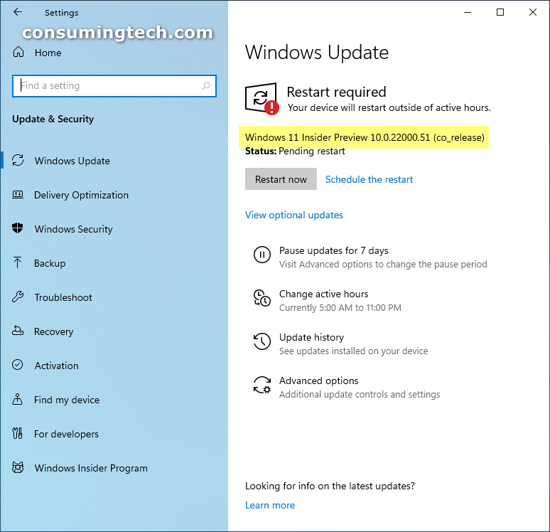
Windows 11 has been updated to version 10.0.22000.51. This update to the Insider Preview channel was released on June 28, 2021.
Insider Preview 10.0.22000.51 is one of the last Windows 11 preview builds that will be available before Windows 11 is officially released.
Insider Preview 10.0.22000.51 comes with lots of changes. When Microsoft announced this update, they included most of what has changed between Windows 10 and Windows 11. So, if you want the full list of features, please check the full release notes here: Announcing the first Insider Preview for Windows 11.
Insider Preview 10.0.22000.51 completely revamps the taskbar. The Start menu is hardly noticeable at first glance because it’s no longer positioned where Windows users have known the Start menu to be, which is to the far left side of the taskbar. Microsoft is hoping you can identify the Start button rather than the Start menu. And that then you’ll put two and two together and understand that inside the Start button is the Start menu. that doesn’t sound too difficult — that is until you click on the Start button. Once you open the Start menu, most people won’t understand that it is intended as being the old Start menu still because the list of All Apps has changed locations. Instead of the apps being listed in what Windows users knew as the Start menu immediately after clicking the Start button, it’s now hidden behind another click (the All Apps link in the top right corner). It’s a big change and one that we didn’t understand ourselves without a Microsoft employee jumping in to point us in the right direction.
Microsoft is known for making lots of changes, and that is fine if the changes can be justified. So, is the new “Start menu” better than the old one? If you felt as though you were running out of space to pin icons to the taskbar, then the answer is probably yes, because the new menu showcases pinned icons immediately and there was no place for them to be before at all. The problem is, I wasn’t running out of space to have pinned icons. Matter of fact, I hardly pinned anything to my taskbar. If anything, I reduced the number of pinned items on the taskbar from the default number that came with Windows 10. So for me, this new menu isn’t better than the old one — it just means I need to make an extra click to get to what I used to know as the Start menu, which was the list of all apps that I could scroll down, because that list of apps was something I used regularly.
The new notifications are in the style of widgets. We saw examples of these widgets before Windows 11 was announced as it had been said that they were arriving for Windows 10. They looked good, but the changes extend further in Windows 11 than what was obvious back then. In Windows 11, gone are the general settings you had at the bottom of the Action Center; now that area is replaced with a Calendar. To get to the settings, you now have to click on one of the existing icons in the notification area — either the WiFi icon, sound icon, or battery icon if you are using a laptop. It’s concise but sacrifices some common sense in the process of creating its conciseness. For instance, in order to adjust the brightness, you have to think to yourself of clicking one of the three mentioned icons rather than just heading to the old Action Center. Most people can accept that that is the way it is now, but can we say it’s better? Unfortunately, quite a few of the changes that have been made seem like they’ve been made because the developers needed to do something or else there would be no need to hire them. Lots of things are shuffled, but I’m not convinced things are better than they were in Windows 10.
Related Articles
- Windows 10 KB5004296 Fixes Gaming Services for Desktop and More
- Windows 11 KB5004252 Brings Entertainment Widget and More
- Windows 10 KB5004237 Updates Username and Passwords, More
- NVIDIA – Display – 27.21.14.6275 for Windows 11
- Windows 11 KB5004745 Adds Search Field to Start Menu
- Cumulative Update for Windows 11 (10.0.22000.100) (KB5004300)