Last Updated on January 31, 2020 by Mathew Diekhake
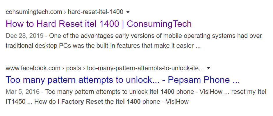
A couple of weeks ago, Google rolled out an update to the desktop search results to include the website favicon (icon) next to the text. The move was made to mimic further mobile search results, which have been using the favicons for some time already.
The favicons offer a way for Google to be more conspicuous with their advertisements, because they now put the word “ad” where a favicon would be instead of having to put the advertisements as clearly visible ads above or below the organic content. Some have suggested this was Google’s main motivation in the move.

According to “user feedback,” people preferred the mobile search results to show the favicons. The thing is, Google is renowned for not taking feedback and having no interest in what you’ve got to say about almost anything, so we’re not sure where this feedback is supposedly coming from.
For years now, Google search results have gone backward. No longer is being able to write a sentence much of a priority, so it doesn’t surprise us that Google has taken another step in the direction of valuing visuals over what the text says. In recent months, Larry Page has stepped down as CEO and given the position to the Indian Sundar Pichai.
The move to desktop favicons has been met with backlash on social media. The ‘Google SeachLiaison,’ who is supposedly Danny Sullivan, has publicly stated Google is still testing what they will keep as the ideal favicon location. It seems to have given some people hope that the favicons will disappear altogether once again, but that’s not how we perceive the tweet. Google may move the favicon slightly, but we don’t think it being removed is likely happening.
Depending on what search results you look at, the favicons can be helpful. If you know what website you want to visit, it can help you find it easier if that website isn’t always at the top of search results. However, for general use, the favicons are more of a distraction away from the text. Google has consistently defended its stance on showing favicons as an excellent way for publishers to enhance their branding. Favicons in search results still appear blurry and far from the same quality as what you would find on the websites themselves.
Here’s our full statement on why we’re going to experiment further. Our early tests of the design for desktop were positive. But we appreciate the feedback, the trust people place in Google, and we’re dedicating to improving the experience. pic.twitter.com/gy9PwcLqHj
— Google SearchLiaison (@searchliaison) January 24, 2020
Related Articles
- Google Chrome to Stop Incognito Mode Detection as of July
- How New Microsoft Edge Will Roll Out for Windows 10 Users
- Final Update to Windows 7 Blackens Desktop Wallpaper
- Windows 7 Users Issued Final Windows 10 Upgrade Warning
- Windows 10 Free Upgrades Are Still Available Via Media Creation Tool
- Windows 10 Mobile No Longer Supported By Microsoft
- Windows 10 1903 Update Management Changes for WSUS and Config Manager
- Avast and AVG Browser Extensions Caught Spying via Chrome and Firefox
- TeamSnap Allows for Importing Sports Calendars in Microsoft Outlook
- Progressive Web Apps in Microsoft Edge to Improve Native Apps in Windows 10

January 28, 2020 @ 02:14
After being extremely disappointed with favicons, I’m now very pleased with the new gray and blue search results they’re showing me without the favicons. It reminds me of the style of some of my favorite blogs. It’s simple yet as practical as possible in my opinion.