Last Updated on December 3, 2020 by Mat Diekhake
Google Chrome is now ten years old. Google has marked this anniversary with a massive release called Chrome 69. It’s been a while since we’ve seen a Chrome release with as many features as this.
The one that everyone notices first is the new material design, or what people commonly refer to as the feature that makes the new Chrome now look rounded—from the curved address bar all the way down to the rounded favicons that appear on the front page as suggestions for webpages that you might want to load based on past experiences, known as shortcuts. You can also create custom shortcuts so the favicons for websites that you see are based on what you want to see rather than Google picking them based on what it knows is your most visited sites.
Chrome 69 comes with some other cool features, such as the chance to select custom picture backgrounds for new tab pages so you don’t have to just look at the same old basic Chrome white background. This is a feature that isn’t enabled by default because it requires you to add the pictures that you want to see for the custom backgrounds, but it is there for when you want it.
There are other useful features, such as the built-in password manager that can autogenerate new password for websites and save them so you don’t have to re-enter them, too. The Chrome password manager isn’t new, neither is the option to save passwords, but automatically generating new passwords is usually functionality reserved for the websites that you’re using and not something that a browser could control.
You’ll still find more goodies jampacked inside as well, like the revamped Omnibox that shows details when you start typing, a built-in ad blocker for blocking selected ads from sites that Google deems to be unnecessarily hindering people’s user-experience online, Ease of Access now available on mobile, a simpler padlock for SSL that no longer feels the need to let you know if a site is secure or insecure in writing, plus quite a few other features as well.
The new rounded UI you get automatically when your browser updates itself is called the Google Chrome material design refresh. You might have seen articles about it in the past few months about enabling it before the official Chrome 69 released. If you don’t like the design changes, Chrome still allows you to keep the updated version of the browser and remove the design changes, so it still looks like the old Chrome. That way you still get to benefit from the other feature updates, your browser is still more secure, and all without you losing the all-important visual appeal.
How to Disable New Rounded UI in Chrome 69
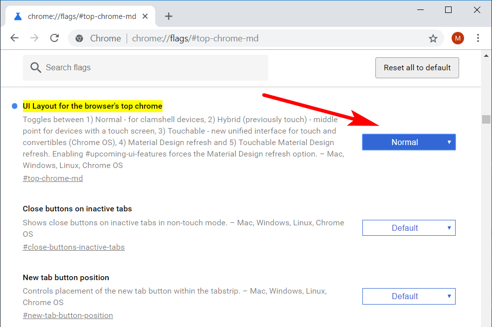
1. Open the Google Chrome web browser and then type the following into the address bar: chrome://flags/#top-chrome-md
2. You’ll now see the Chrome flags page where you can find a bunch of optional features, one of which being the option to disable the new rounded UI that’ll now be the top option on your computer’s display.
3. Where it shows the setting “UI layout for the browser’s top Chrome” change it to “Normal” from the drop-down menu.

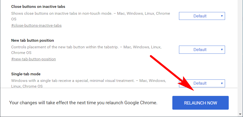
4. At the bottom of the same window click on the “Relaunch Now” button if you want the changes to take effect immediately.

5. How the Google Chrome web browser looks with the new rounded UI look:

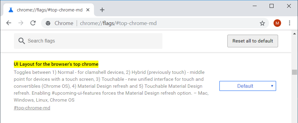
6. How Chrome looks once you’ve changed back to the old Chrome window:

That’s it.
The first thing you’ll probably notice is that it hasn’t changed absolutely everything to do with your new design. For instance, you’ll still have the rounded favicons for now from the new tab page. It’s just the top of the browser window which reverts to the older style of Chrome before the rounded edges came into play.
I wasn’t a huge fan of the rounded edges when I noticed Chrome first update itself on my computer because my education has taught me that rounded is more feminine. But after making the switch back, I can understand how the old style is now looking a little dated. Either way, Chrome remains my favorite browser to use until someone else can get a webpage to load as elegantly and make a settings menu that is as easy to use. There remains the issue of extensions not being available for other browsers, but the competition has so far to go to be on par with Chrome just with its basic functionality as a web browser that I don’t even care to look that far ahead. Edge can keep saying that it’s quicker than Chrome as much as it wants, but it doesn’t look or feel quicker. That’s the problem.
Related Tutorials
- How to Disable Password Saving in Google Chrome
- How to Apply Dark Incognito Theme to Google Chrome Regular Mode
- How to Manage Audio Focus Across Tabs in Google Chrome
- How to Enable Rich Search Suggestions in Google Chrome
- How to Disable Not Secure Badge for HTTP Web Sites in Google Chrome
- How to Enable Picture-in-Picture Mode in Google Chrome
- How to Enable Lazy Loading in Google Chrome
- How to Enable/Disable Native Google Chrome Notifications in Windows 10
