Last Updated on November 14, 2019 by Mat Diekhake
The new Firefox 57 web browser has some empty white space on either side of the address bar at the top of the browser window. That space can be used up for other icons, plus a little bit of it needs to remain on the right side for when you download files.
If you didn’t plan on running any extensions, then you might just prefer getting rid of the white space, so the gaps between the address bar and the current icons are removed.
Mozilla allows you to do that from the Firefox 57 customizer. Once you click on the “Customize” button, you have activated a new customizer mode where you can then make some changes that customize the browser from its default settings. It’s in here where you’ll be able to find the option for removing the gaps.
How to Remove Address Bar White space in Firefox 57
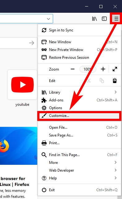
Open up the Firefox 57 web browser—regardless of what page you have open(it can be a new tab page or any webpage from a website)—and then click on the three horizontal lines, commonly revered to as the “Hamburger” icon that is in the top right corner of the browser on the computer’s display.
Click on the link that says “Customize” from the hamburger menu.
Your Firefox 57 web browser will now automatically be put into the customizer mode which allows you to start customizing and those changes will also take effect as soon as you do them so you can start seeing the results before you reopen the browser window. At the top of the customizer, each side of the search box, are two blocks representing your white space. Click and drag the blocks out of the location and drop them into the main part of the customizer window. They’ll then disappear and so will the gaps.
Here’s what the Firefox 57 looks like with the gaps on either side of the address bar:
And her’s what Firefox 57 looks like when the gaps have been removed:
If ever you want the gaps to be put back again, you just head to the same customizer and then click on the “Flexible Space” icon and drag the boxes back into their position with a standard click and drag of the mouse.
In all our reading that’s been done over the past week or so on Firefox 57, there have been times when we’ve come across other sites refer to these empty white spaces that are collecting dust as some of the “most annoying” parts of the new web browser. We personally wouldn’t go that far, mainly because we can see that there is a reason behind them being there. However, if you don’t plan on filling the available spaces with more stuff, then you might want to get rid of them by using the guide above.
You might also be interested in:
- How to Add Search Box to Firefox 57 Quantum
- How to Enable/Disable Drag Space in Firefox 57
- How to Add Downloads Button to Firefox 57 Quantum
- How to Disable/Enable Library Highlights in Firefox 57 Quantum
You can subscribe to our RSS, follow us on Twitter or like our Facebook page to keep on consuming more tech.


November 25, 2017 @ 11:09
Thank you, but how do I get rid of the address bar completely. I used to use Classic Theme Restorer, but it doesn’t work with Firefox 57. 🙁
November 25, 2017 @ 22:36
How will you browse for your websites without the address bar?
Yeah the Classic Theme Restorer is no longer supported due to there now being only support for WebExtensions.
You might be able to remove it with CSS but I’m not sure if it’s even an option with that. Here is the CSS you can modify: https://github.com/Aris-t2/CustomCSSforFx
Aris — the same developer who did Classic Theme Restorer — created this CSS option so people can modify the browser that way instead.
CSS is not easy to play around with yourself. It’s what developers use to develop styles. You might want to ask him how to do it and then copy and paste the code he gives you.