Last Updated on January 25, 2020 by Mat Diekhake
If you thought the homepage of our website looked too dull to be desirable, let us first point you toward Google’s search results, where for decades you have gotten nothing but links and descriptions for the sake of optimal user experience and performance.
We have been criticized in the past by Google volunteer workers, among others, for lacking pictures, when Google itself doesn’t show any graphical content in its results. That double standard has up until now kept us feeling pretty confident that there isn’t anything wrong with the user experience we’re offering, nor would Google be judging it as such.
That said, if you think that Google doesn’t make changes to its appearance, you would be wrong. You might not realize it, but Google is continually trialing and erroring different results to see how people interact with them. These little experiments happen around every few months, and you can keep up with them if you follow a good search engine blog.
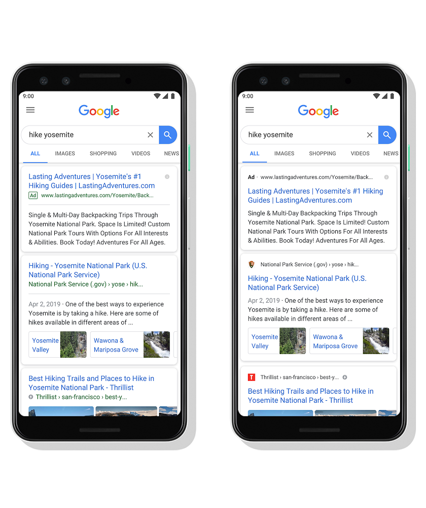
Now some of Google’s latest tests are going to come to fruition: you can expect to find a website’s icons (known as favicons to webmasters) from Google’s mobile search pages, in an effort to help enhance the Google search experience. Rather than the URL shown next to results, you’ll get the website’s name listed above the link. The website’s name will now be gray instead of the traditional green URL link.
You could argue that a gray name is more conspicuous than the older green URL, but the fact that the name now appears on top of the link does put extra emphasis on it being the name of a website and not just a link. The new results will also favor those websites with strong branding in the logos. A red logo, for instance, may do wonders for attracting readers’ attention away from other competitors on the results pages, as can be seen from Google’s own example.
Over the year’s webmasters have never taken names too seriously. Most of our peers have strange names for websites, and some of them have no meaning at all—and aren’t even words. If you were to listen to someone around their fifties talk about what they trust online, though, a lot of them do take details like a website’s name seriously before trusting the content they’re reading.
While it might seem like a great idea to give people more detail on where they’re getting their information, rather than ensuring the best information is what pages people are landing on, in reality, it is the people who need to start understanding how the Web works for them to truly start getting the information they need. For instance, there are only so many words that make up the English language, and since there are now over two billion domain names taken, you can’t expect every reliable source of information to have a nice name or even unique logo. Webmasters had figured this out long ago, and unfortunately, it looks like they’ll need to sit through a period of history repeating itself and watch as the average reader now learns this lesson firsthand as well.
If you are one of the sites feeling a bit nervous about how you will be perceived, you can rest assured knowing that, eventually, search results like this will give you good branding, once readers understand that you can’t always judge a book by its cover. Keeping your business afloat until then is the only challenge.