Last Updated on April 9, 2017 by Mathew Diekhake
If you have the Sony AR application on your Xperia device it’s time to lookout for a new system notification alerting you of a new app update. It moves the build number from 3.1.12 to 3.3.13, so as you can imagine, it’s only coming with minor adjustments.
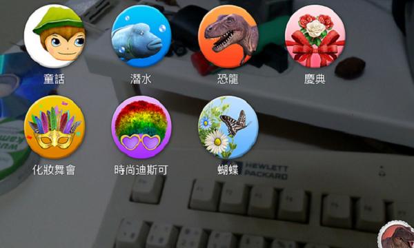
The new build number comes with improved user interface, the ability to check pictures and videos quicker, share the picture and video with social media account and the usual bug fixes and UI tweaks. The “improved UI” the official changelog is mentioning includes a AR Effect change. You may recall the old style where it shows the app icons you have downloaded already and one box in the top left corner indicating the number you can “get more.” Well, that box is gone now and you have the number of icons that were sitting in the “get more” box all displayed down the list.

That presents one problem: how do you distinguish the apps you already have installed from the ones that are not installed if you are viewing all the icons on the screen? The ones you have downloaded appear as they were, while the ones waiting for download have a green arrow partly taking up some of the icon. You can easily identify this arrow. The green arrow means tap to install.
As you likely know already, you don’t need to back up the existing applications before updating to new versions. However, those preferring to do things by the “app book” can try using Helium for Android to back up the market applications if something goes wrong. Now you have extra copies of the same.
Please let us know in the comments how you are finding the change. Do you think it looks better showing all the icons or did you prefer the old design? Is it more practical to see the green arrows? Perhaps it’s persuading you to install some extra themes more because of the visuals from the icon enticing you? Let us know what you think about the change.
