Last Updated on December 28, 2018 by Mat Diekhake
The Firefox 57 web browser is one of the finest portals to the internet one can use, partly thanks to its groundbreaking features and partly because it borrows all the existing best ideas from other browsers. If you go back a decade or so, the average web browser wasn’t very intelligently put together. The user experience subsequently suffered, namely because the older browsers weren’t making very good use of the screen real estate for the browser and its toolbars and it was having adverse effects on the user experience when browsing through many of the websites to be found on the web.
Lately the average web browser has become a lot better: they all use about the same amount of screen real estate as each other, though Google Chrome still seems to be leading the way by a bit when it comes to offering a browser that allows the largest space dedicated to the webpages you visit.
Firefox is almost exactly the same as Microsoft Edge in this regard—we’ve actually taken out the ruler and measured it just to make sure. You could easily argue that Edge used up too much of the screen when Microsoft released the earlier generations of the Surface Pro devices, and that was peculiar since both the Surface and Edge are owned by Microsoft so you’d think they would have noticed the same thing and fixed it. Outside of the Surface Pro range, however, Edge is fine: you can use Edge without any trouble with another device like the Surface Book for instance, and the newer generations of the Surface Pro lineup have larger screens than the first couple did, too.
Firefox 57, otherwise known as Firefox Quantum, has brought a range of new features with it, and some of them you won’t find available with other web browsers: the change to now see “Highlights” from the new tab page being one of the best that many people will be able to make use of without too much trouble.
If you don’t mind losing a bit more of your computer’s screen real estate, you can also use another feature called the Firefox title bar. The title bar shows you the name of the website, and its description above the page you are viewing. You get a taste of it anyway when you look at the tab that is loaded, but since the tab is only small, part of the would-be full title has no choice but to be cut off when the tab finishes. The title bar feature addresses that issue specifically so you can see everything it was meant to say. Unlike the Highlights feature, the title bar isn’t enabled by default, so you’ll need to venture into the settings to get it working.
How to Turn On/Off Title Bar in Firefox
You can enable or disable the Firefox 57 title bar from within the browser settings. To do it, just click on the “Hamburger” icon available on the top right side of the browser window, signified by its three horizontal lines. Then, with the menu open, click on the link that says “Customize” to get access to everything that’s related to customizing the Quantum browser.
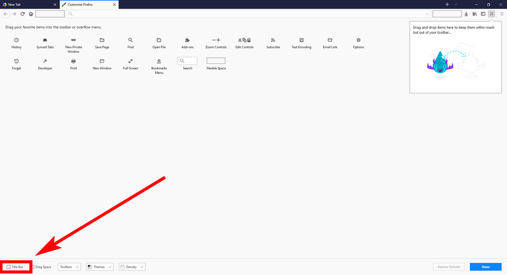
Now look at the bottom of the customization page for the “Title bar” checkbox. Click the cursor in it so that it has a checkmark when you want to enable the title bar and remove the checkmark from the checkbox when you want to disable it.
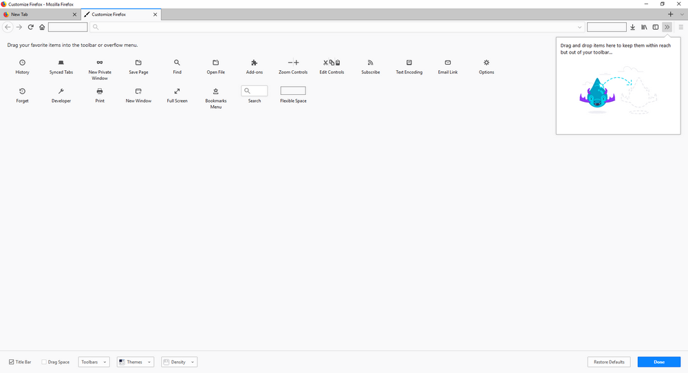
Like with many of the Firefox Quantum features, the change is noticeable straight away after you check or uncheck the box without you needing to do anything else so that you can trial it with the same webpage open. The new bar at the top of the computer’s screen is the title bar.
The title bar does a pretty good job at doing what the name suggests and showing the full title of the website that you are visiting, but it is also handy for something else, too. When you have it enabled, you no longer see the blue part of the address bar in Firefox 57, which is usually anything that doesn’t have a tab on it. Some people like the blue color and others refer just having gray. The title bar gives you that gray look without the blue, a bit like how the Microsoft Edge or even Google Chrome looks. Of course, those others browsers don’t have the title bar at the top taking up extra space, so that’s the trade-off.
You might also be interested in:
- How to Turn Off/On Highlights on New Tab Page in Firefox
- Here’s What’s New in Firefox Quantum, and Why You Ought to Think About Installing It
- How to Find IP Address in Windows 10
- How to Search Videos within a YouTube Channel from Mobile Phone
You can subscribe to our RSS, follow us on Twitter or like our Facebook page to keep on consuming more tech.


